
Silverteck
Where businesses come to life
Create a brand identity befitting a company that builds experiences for Fortune 500 clients.
Silverteck produces immersive brand experiences, product launches, and corporate events for some of the world's most recognizable companies. Yet their own brand looked like a generic event staffing agency.
The disconnect was damaging: they were losing RFPs to competitors with inferior capabilities but superior positioning. When you pitch experiential excellence, your own brand must exemplify it.
We were tasked with creating an identity system that positions Silverteck as a strategic production partner, not a vendor. The brand needed to signal: 'We operate at your level.'
Strategic Direction
Precision as Personality
We identified that Silverteck's true differentiator isn't creativity — every agency claims creativity. Their edge is precision execution: the ability to deliver complex, high-stakes experiences flawlessly, every time.
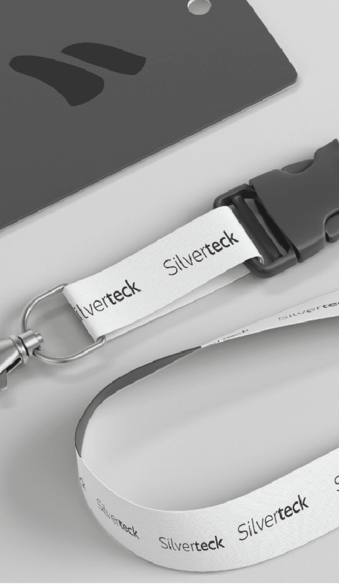
The visual identity was built around this precision. The logomark combines an 'S' and 'T' into an interlocking geometric form — a visual representation of components fitting together perfectly. It feels engineered, not illustrated.
The color palette centers on deep silver (hence the name) with accent frequencies of electric blue. This signals technology, sophistication, and modernity without abandoning the premium space.
Typography was selected for its technical character — clean, precise letterforms that communicate efficiency. The stationery system includes subtle embossed details that only reveal themselves on close inspection, rewarding attention the way a great experience does.


Project Result
“...”
Build Brands That Perform.
Build a brand that looks as good as it performs, commands attention and runs like a well-oiled machine.